WordPress Tutorial: Visual Composers Charts
WordPress Tutorial: Visual Composers Charts
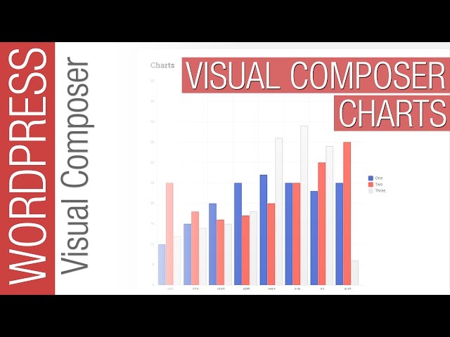
Visual Composer for WordPress offers some great chart widgets to display your data in a multitude of eye catching ways.
This video takes you through the process of setting up and using all 4 currently on offer as well as the variations available in each one.
Use pie charts, doughnut charts, line charts, bar charts and more.
PURCHASE VISUAL COMPOSER:
(This link is an affiliate link, which means that if you click on the link above, I’ll receive a small commission)
SUBSCRIBE
LETS CONNECT:
SUPPORT: Our website offers additional information and perks. Please check it out!
Not easy at all to do a tutorial on these modules (Charts) and you just do it and do it very well! 🙂 Congrats! 🙂
I am having some trouble adjusting the size of the charts (my bar chart is far too tall). Are you able to point me in the right direction as to how to do that? Cheers
I really like your tutorial and the vc plugin. How do I go about change the colors in the drop down?
how to add (%) in Y-axis values
Values showing only on the mouse hover is not a great idea, should allow to display as default.
Very good Video Thanks you Sir.
Robert UK London.